- Author
- app-hacks
- Published
- Updated
- Reviewed
CSS / Design Systems / Custom Properties
Manage Theme Values with CSS Custom Properties
Learn how to manage colors, spacing, and typography with CSS custom properties so component values stay consistent.
Manage Theme Values with CSS Custom Properties
CSS custom properties share recurring values such as colors, spacing, radii, and type sizes across a stylesheet. Their value is not only centralization: names based on a value’s role make theme changes and new components less likely to introduce inconsistent values.
Define Values by Role First
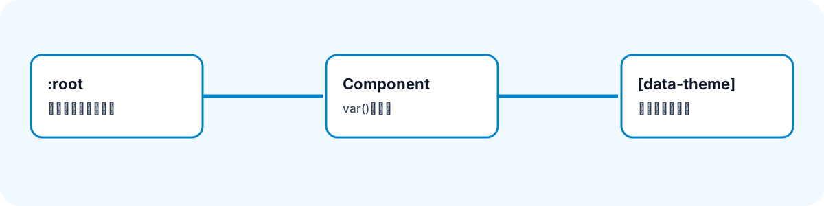
Place site-wide values in :root. Mixing names such as --blue-500 with roles such as --color-link makes usage harder to reason about. For a small site, begin with role-based properties.
:root {
  --color-text: #1f2937;
  --color-surface: #ffffff;
  --color-link: #0f83d8;
  --space-4: 1rem;
  --radius-card: 0.75rem;
}

.card {
  color: var(--color-text);
  background: var(--color-surface);
  padding: var(--space-4);
  border-radius: var(--radius-card);
}
Components refer to var(--color-text) instead of repeating literal color codes and pixel values. Changing a link color or card spacing then does not require searching for the same literal across several files.
Do Not Add Too Many Layers
Custom properties can be redefined, but a deeply nested chain makes the final value hard to trace. A chain where --color-link references --brand-primary, which references another property, is better postponed until multiple themes genuinely need it.
Start with three small groups:
- Colors for text, surfaces, borders, links, and emphasis
- Spacing steps for padding and gaps
- Shape and type values for radii, shadows, and text sizes
One-off values and calculations meaningful only to a single element do not need to become shared properties. Prefer knowing exactly what to change over creating more variables.
Change Only the Referenced Values for a Theme
The same property can be redefined in a narrower scope. Overriding color values on an element with a data-theme attribute changes the theme without changing every component.
[data-theme="dark"] {
  --color-text: #e5e7eb;
  --color-surface: #111827;
  --color-link: #7dd3fc;
}
Role names such as --color-text retain their meaning when their actual colors change. This is easier to maintain than creating variants such as .card-dark for every shared component.
Understand Fallbacks and Scope
var() accepts a fallback as its second argument when a property might not be defined.
.notice {
  border-left: 4px solid var(--color-notice, #0f83d8);
}
Using a fallback for every core theme value can hide missing definitions, so reserve it for intentionally optional values. Custom properties inherit from an element to its children. Define global values in :root, and limit local overrides to the relevant component root so they do not unexpectedly affect descendants.
Keep Names and Reviews Consistent
Consistency matters more than a rigid naming scheme. Prefixes such as --color-*, --space-*, and --radius-* make values easier to find. Before adding one, ask whether it is used in at least two places and whether its role can be explained. After a theme change, check text-background combinations, link visibility, and focus styles.
Custom properties are not only a way to shorten CSS. They create a shared vocabulary that makes a stylesheet safer to change. Begin with a small role-based set and add new values only when real repetition appears.
Not every value needs a variable. Sharing a value used once, or an element-specific calculation, can make a stylesheet harder to trace. Start with repeated theme values such as colors, spacing, radii, and type sizes. A consistent naming convention and definition location keep the impact of a change clear.