- Author
- app-hacks
- Published
- Updated
- Reviewed
CSS / Responsive Design / Typography
Design Responsive Type Sizes with CSS clamp()
Use CSS clamp() to define minimum, fluid, and maximum type sizes without multiplying media queries, while keeping text readable.
Design Responsive Type Sizes with CSS clamp()
When type changes at several breakpoints, separate media queries for every heading can make the intended scale difficult to maintain. CSS clamp() keeps a minimum value, a viewport-responsive value, and a maximum value in one declaration. It can prevent type from becoming too small on a narrow screen or disproportionately large on a wide one.
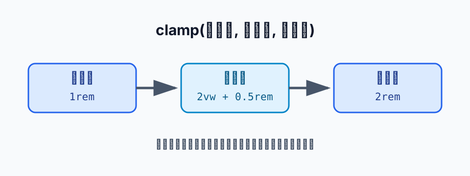
Separate the Three Arguments of clamp()
Write clamp() as clamp(minimum, preferred, maximum). The browser uses the middle value while it is in range, the minimum below that range, and the maximum above it.
.page-title {
  font-size: clamp(1.75rem, 4vw, 3rem);
  line-height: 1.2;
}
Here, 4vw follows viewport width. On small screens it cannot fall below 1.75rem, and on wide screens it cannot exceed 3rem. Unlike using vw alone, the declaration makes both the readability floor and layout ceiling explicit.
Choose the Bounds Before the Formula
It is safer to decide the smallest and largest acceptable sizes in the current design before tuning a fluid formula. Keep body text comparatively stable, and begin with page titles or major headings where width makes a visible difference.
For example, if 28px works on mobile and 48px on desktop, convert those bounds to rem and use them as the first and third arguments. The middle expression does not need to be perfect on the first attempt. Review narrow, intermediate, and wide widths, then adjust it while watching wrapping and surrounding space.
:root {
  --size-title: clamp(1.75rem, 1rem + 2vw, 3rem);
}

h1 {
  font-size: var(--size-title);
}
Putting the value in a role-based custom property also prevents headings at the same level from drifting apart. The naming and scope approach pairs well with managing theme values with CSS custom properties.
Check Line Length and Leading Together
Changing only font size changes line length and where headings wrap. After introducing clamp(), check that headings do not unexpectedly become three or more lines and that their contrast in scale with body copy remains intentional.
.article-body {
  max-width: 72ch;
}

.section-title {
  font-size: clamp(1.35rem, 1rem + 1.4vw, 2.1rem);
  line-height: 1.3;
}
Limiting line length with ch is one way to keep paragraphs from becoming excessively wide as type changes. Font metrics differ, however, so treat the number as a starting point and review it with the actual font and content.
Do Not Replace Every Breakpoint with clamp()
clamp() suits values that should change continuously. Structural changes—such as stacking navigation or changing a card grid’s column count—still belong in media queries. Separating fluid sizing from layout switching makes the CSS easier to reason about.
For adoption, decide the target element, its bounds, and the viewport widths you will review. clamp() is concise, but using it without deliberate bounds can make headings or buttons hard to read. Start with one heading level, check wrapping and space with real content, then extend the pattern.