- Author
- app-hacks
- Published
- Updated
- Reviewed
CSS / Responsive Design / Component Design
Build Component-Responsive Layouts with CSS Container Queries
Use CSS container queries to switch a component based on its own available width, making reusable cards more responsive than viewport-only rules.
Build Component-Responsive Layouts with CSS Container Queries
Media queries use the viewport as their reference. A card reused in both a sidebar and the main content can therefore change layout at a width that does not fit the space it actually has. Container queries let a parent expose its size and let a child component switch styles based on its own available width.
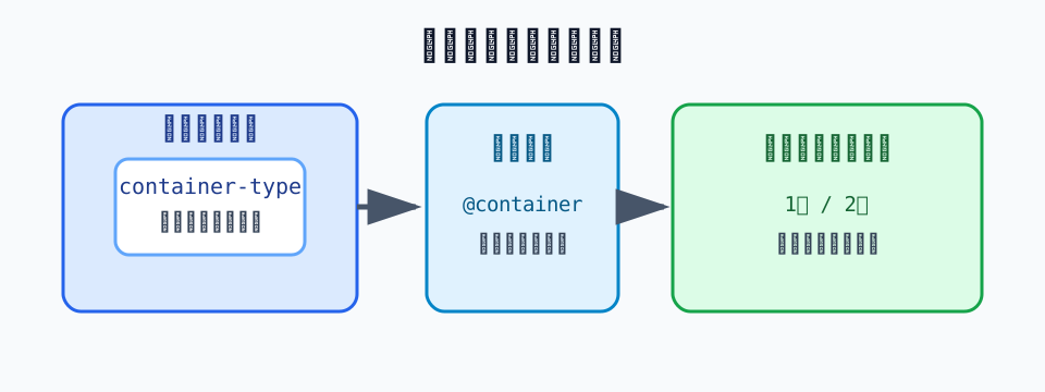
Register the Parent as a Query Container
Declare container-type on the parent that determines the component’s available width. inline-size enables queries along the inline axis. Naming the container makes the target explicit when a page has more than one container.
.card-list {
  container: card-list / inline-size;
  display: grid;
  gap: 1rem;
}
This declaration does not change the card by itself. It defines where a child may query a size, while the child-side @container rule reads that size. Name containers after the layout space they provide rather than after a color or visual treatment.
Switch the Component’s Columns by Its Available Width
Keep the card as a one-column layout by default, and switch its internal layout only when the available space is sufficient. Because the condition uses card-list rather than the viewport, the same card can adapt when it is placed in a different parent.
.card {
  display: grid;
  gap: 0.75rem;
}

@container card-list (min-width: 36rem) {
  .card {
    grid-template-columns: 8rem 1fr;
    align-items: start;
  }
}
Choose the boundary from the minimum width at which the card title and description remain usable, not from a device-width convention. If the content changes, the useful boundary may change too; do not copy the number to unrelated components as a universal answer.
Separate Container and Media Query Responsibilities
Page-wide navigation and major structural changes can be clearer as media queries. Cards, search results, and pricing plans are good candidates for container queries because their placement can change while their internal behavior stays component-local.
/* Page structure follows the viewport. */
@media (min-width: 60rem) {
  .site-header {
    display: grid;
    grid-template-columns: auto 1fr auto;
  }
}

/* A reusable component follows its parent container. */
@container card-list (min-width: 36rem) {
  .card__actions {
    justify-self: end;
  }
}
Mixing the two reference frames makes the trigger for a change harder to trace. Decide first whether a rule describes page structure or component structure, then choose the corresponding query type.
Verify the Boundary with Real Content
After adding a container query, check a wide region as well as a narrow sidebar, an embedded content area, and long titles. Around the min-width boundary, review wrapping, button width, and image shrinkage so a single long string does not break the layout.
Renaming a container or moving a component can make a condition stop matching. After moving a component, verify not only its class names but also that an ancestor still registers the expected container. If values are managed with custom properties, the naming approach in managing theme values with CSS custom properties can help keep the component’s responsibilities clear.